
To add a background image for you blog,
1. Edit your Template
2. Now find out
body {
( press 'Ctrl' + F to open your browser's search box)
Now paste this code line just below it , after adding the URL of your back ground image
background:url( Paste your URL of Background Image );
Background Patterns for you
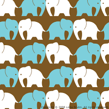 background:url( https://blogger.googleusercontent.com/img/b/R29vZ2xl/AVvXsEhhCZ1YFelmWR9hZXFHrKqy_4jSf4L0ylm5nGsUaZ0BXadsMj9OafVURXzhCgPQKob2AEns7LoBY-fIdQaHe9qpelKfs9KuGu_BCrVyZkku07aFiMOaa_MT_zksDitygQ_mq9jm1F0gOFQ/s400/elephant_pattern.gif );
 background:url( http://z.about.com/d/graphicssoft/1/0/9/2/5/Textile_Pattern_Set-2.png );
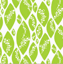 background:url( https://blogger.googleusercontent.com/img/b/R29vZ2xl/AVvXsEgENXLARkRtCmfUuXSi2sakmWiU3lsyUIL-IQjD4ekaxpBCkejGFPpgxMLQvhRkRJ98Y3yJZYUQy3i4Tbi-oj4frbRfF1ZoVnYH6v3kAqlakmN7PRQQ7SFlPCf3fGClulEjUuGwFJgM6RKs/s400/the+pattern+tester.jpg );
Now follow the Safety Saving Steps.
And


2 comments:
I'm on the fence about this, while more customization is good, I have a feeling this is a "in-progress" update, it just feels incomplete and half-way there.
We use badge layout for apps on design approvals (visual projects), so the image being displayed is important. Old layout "feels like" it had larger images,
maybe because the images were cropped more loosely so it's easier to tell which project it was at quick glance. Now the image is cropped closer, making it
harder to scan thru at quick glance. I find myself needing to click into the project more often than usual. Which makes the whole user experience less
efficient.
I have a couple suggestions that might make it work better:
1. Increase the height of the window the cover image is being displayed.
2. Let us to choose which image to be displayed as "cover" (like how Pinterest handles cover images of each board, was hoping for this for a long time)
3. Let us adjust which part of the image to show and how tight or loose the crop is (with a fixed window, let us move the image around and maybe enlarge or
shrink it to control what shows thru the window. Pinterest does a limited form of this, which is very useful in making the cover image relevant)
4. Allow Cover Image to be ordered in different hierarchy (currently every element can be ordered differently except the Cover Image, it seems to be stuck
in the 2nd spot, would like the option to set it on another spot in the layout. This one seems like an easy fix, since you guys allow that for every other
element already)

The Word Validation image has been removed and no need to Sign In. So don't be lazy ..........